Sunday

Copying the Masters

From Ron Hazell's "A Summer Morning" - Watercolour on paper, 9" x 12"
In art, the tradition of copying the masters goes back very far; I wouldn't be surprised if there was never a time when it didn't exist.

So I hope that if Mr. Hazell ever sees this, that he will feel flattered, and not accuse me of copyright infringement!

I chose this painting because I loved the colours, and because it contained some puddles and Mr. Hazell is a master at painting them. (I discovered my passion for puddles when I lived in San Miguel de Allende, Mexico, where my favourite painter, Dan Rueffert, was rather famous for putting puddles in most of his paintings. I googled him today and found that he's very much alive and painting, but not so many puddles any more. Click here if you want to see one of his recent puddles.)

I admire Ron Hazell very much. I'm glad he lives only a few hours away, in Halifax, because I hope to take one of his workshops next spring.

A few weeks ago, I purchased one of his DVDs; I'm sure that watching it helped me paint this copy though I resisted the temptation to put it on while I was doing the actual painting.

It's not a perfect copy -- it wasn't meant to be, but what I like about it is that I was able to capture the light, the strong light that appears to emerge from the street between the first and second buildings on the left and to flood the sidewalk and the big gateposts on the right, and to bleach out the leaves of the big tree.

I also like how the blue buildings fade out gradually, creating the necessary depth.

My puddles are only so-so, while Ron Hazell's are little works of art in themselves.

I should have reviewed his puddle demonstration before painting them!

Thursday

A Christmas Card

We have to take a Christmas card to the last watercolour class, two weeks from now. A Christmas card that we paint ourselves, of course.

Apparently, we have a little party on that day, consisting of eating our own lunch and exchanging Christmas cards.

Of course I panicked: what if I don't have time to paint a card in time? So I made it right away. This is it:


I wanted to stay away from the snow-covered trees and snowman clichés. My original idea was a starry night sky with the stars being produced by salt crystals. But my deep indigo blue sample didn't work out because the mixture stained the paper and so the salt didn't reveal any white at all.

So I changed to Winsor Blue and this is the result. (It's actually a bit darker than here.) The letters were produced by printing the outline on my inkjet printer, directly onto the watercolour paper. Then I filled the letters in with masking fluid. That's why they're so irregular. But I think the imperfections add to the charm.

You're right: this doesn't look like a starry night at all, more like some snow flakes or some fireworks. Or some microscopic sea organisms. That's all right: it can be whatever the recipient imagines.

Of course, in my usual fashion, there had to be some humour somewhere, so this is what I painted on the back:

I think it's kind of cute.

This is a real card, folded in two with plenty of space for a message inside. The size is 8" x 8", i.e., 4" x 8" folded. It fits inside a regular envelope, which is kind of nice.

Populating Landscapes

I don't remember where I first saw the expression "populating landscapes", but it seems to describe very well the action of adding human figures to a landscape as a sort of "accessory" -- as opposed to a person or persons being the main feature or the main focus of the painting.

The only problem with that idea was that I had no clue how to achieve the kind of simplified, stylized, faceless figures that I was seeing in the kind of watercolour paintings that I like: from Ron Hazell to Alvaro Castagnet, and everyone in-between.

Each artist has his or her own formula for rendering people, and that includes Bob Davies, the author or the Watercolour Secrets DVD course that I've just bought. He starts out with a small circle on top of an upside-down cone which he fills out with clothing, and that's about it. It's effective enough.

On Saturday, I took out a quarter sheet of 200-lb paper, inserted the Figures DVD into the laptop, and followed Bob's directions. These are my first attempts at the basic male and female figure:

After a few hours,  I could see a definite improvement.

Sunday morning, I turned the sheet around and continued with the exercises on the DVD. First a family, then a cyclist, and finally a couple in love. Here are my results:

As you can see, I made a few corrections with gouache on the shoulders of the man on the left -- my guys' shoulders always seem to end up too wide -- and to the handlebars of the bicycle. But the couple on the right turned out pretty good right away, even the dog. I did deviate from Bob's example by putting the man's arm on the woman's back.

Speaking of Ron Hazell, he does his people quite differently, more like two cones: one for the top and an inverted one for the bottom.

For my last figure, I copied one of his women. If you look at his gallery, she's in A Summer Morning (No. 3). I think I did pretty well.

I took this sheet to the class on Wednesday, and everyone seemed to like my little figures.

I'm almost ready to start populating my landscapes.

Watercolour Secrets Course

I was excited when the mailman delivered the Watercolour Secrets Course that I had ordered online. I had looked at it before but at US$95, the price was beyond my budget at the time -- I had just forked up $100 for a 10-week course in Fredericton (ten weekly 2-hour sessions, that is).

And then, a few weeks ago, I get an email from the course's creator, Bob Davies, announcing a half-price deal. $56 Canadian, including shipping.

I couldn't resist. $56 for a complete course for beginners, consisting of 9 two-hour DVDs:

  1. Getting Started
  2. Drawing for Watercolours
  3. Skies
  4. Mountains, Hills & Rocks
  5. Trees & Foliage
  6. Water
  7. Buildings & Structures
  8. Figures
  9. Animals & Artifacts
I also got PDFs of all the sketches for the exercises painted during the course. You print them and trace them in order to be able to paint along with Mr. Davies. (Which implies a lot of stopping and starting, which I'm sure is easier with a DVD player than a laptop!)

To be precise, it's a pretty complete landscape painting course. No flowers, no still lifes, for instance. Still...

I have viewed part of every disc and so far, it's mostly good news. Mr. Davies does all the things that are so lacking in most tutorials and demos: he tells you and shows you exactly which colours he is mixing, and to which consistency. That is crucial for a beginner. He also explains what he's doing and why. He is very patient indeed!

He does skip the occasional step, a frustrating habit that all video teachers seem to have. I wish they wouldn't do that! It's usually those all-important finishing touches that get skipped, much to my disappointment.

Also, Mr. Davies needs to talk to his cameraman, who has the habit of not re-focusing the camera when he does a close-up, which results in some very blurry pictures. In addition, the part of the DVD on trees that interests me is all out of focus, and I'm hoping that Mr. Davies will re-shoot that lesson some day, because it's a very important one.

Here's a link to Bob Davies' website which has some free tutorials and other good stuff:

http://www.how-to-draw-and-paint.com/

And this is the link to the different versions of the Watercolour Secrets course:

http://www.watercoloursecrets.com/

Saint John Window

"Saint John Window", watercolour on paper, 9" x 12"
I painted Saint John Window from a photo of a real Saint John (New Brunswick) window that I took when I used to spend some time there. I was going to photograph all the interesting architectural elements of Canada's oldest city, but I never finished that project.

When it came to filling in the panes of glass, I immediately thought of a cruise ship! The port of Saint John is a stopover included in many summer cruises, and I never stopped marvelling at the humongous size of those vessels, which moored a mere block or two from where I lived. They reminded me of the ocean liner scene in the movie Amarcord, one of my all-time favourites.

And should my house have faced the port, this scene would have been a very likely one.

I cropped a great deal of the wall away, and I'm glad I did.

There's a lot about it that I like -- especially the idea itself, the sky, the ship, the colours and the humour in the initial ambiguity (is the viewer inside looking out or is he outside and is the ship a reflection?) -- and I certainly had a lot of fun painting it.

Saturday

A Rose is... Difficult

"Coral Rose", watercolor on paper, 6" x 9"
Roses are one of the most difficult subjects to paint, so am I a masochist?

I thought that if I can paint a rose, I can paint anything.

My first attempt, yesterday, was not satisfactory. I tried to follow Bob Davies' instructions for a realistic-looking rose, which seem so simple. They're not.

I decided to try simplifying my rose -- I was using one of the photos I mentioned yesterday, taken in my little house in San Miguel. I also changed the colour from pink to peach or coral, my favourite rose colour.

Another thing I wanted to practice was shaping the leaves with just some brush strokes. They didn't turn out too badly but I didn't know what to do with them afterwards so I just left them.

I added the stem afterward the first background wash: without one it looked awkward, hanging there in mid-air.

I like the texture of the ultramarine background. I had tried that yesterday and I liked it. To get this deep blue, I had to apply the blue three times, wet into wet. I have a lot to learn about backgrounds; for one thing, I don't think they're supposed to be even all over, like this. But, hey, I have enough to learn right now.

All in all, it's not a bad exercise, because it was a good learning tool. I can spot my mistakes and I know how not to repeat them. Best of all, the rose does look like a rose -- doesn't it?

Thursday

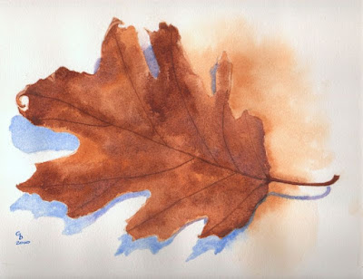
Oak Leaf

Oak Leaf, Watercolour on Paper, 9" x 12" - Click to Enlarge.
Of all the autumn leaves that I collected last week (see this earlier post), this curly old oak leaf was my absolute favourite.

I couldn't paint it right away, so I photographed it, in case something happened to it.

Both the yellow and the blue shadows appeared on the photograph. They are due to the lighting, which came from above.

That solved my problem of what to do about the background.

If you enlarge it, you will see some of the very nice texture.

I think this is my best original painting so far.

Tuesday

Autumn Leaves


Last week, the instructor asked us to bring in some leaves this week because she was going to demonstrate how to mix colors on the paper.

But yesterday  I happened upon an online demo about that very subject, so I decided to give it a try.

 
For my first study, I traced three of the leaves I had dried and just went ahead and painted them. But I keep forgetting how much lighter the pigments dry! So I re-wetted the two large ones, and went over them again. The smaller one I left as is because some of the leaves are kind of pale. All I did to that one was to add some spatter, like the original model.

One trick I discovered is to take a very small brush and extend all the main lobes into a sharp point. I find that makes the leaves look more realistic.

My second study was this single large leaf, that I painted in class, today. I was fascinated by the paleness of the colours, their vibrancy. 

At what point does a maple leaf decide it's going to put on this more subtle kind of show?

(This one will enlarge if you click on it.)


And then I painted this third study, of smaller leaves.

That poor little maple leaf sure took a beating from Nature.

I used violet for the speckles on the little yellow one. And  I like the way the purple one turned out, with its very realistic veins.

(This one will enlarge too.)

I made the veins by scratching with the end of a brush that has a bevel designed especially for that purpose, apparently.

Not to brag, but my leaves were the nicest of the whole class. Yet nary a compliment from the instructor. Hm.

But my favorite leaf is not there. It's this oak leaf that I allowed to dry out in the open, where it acquired some interesting curls.

Friday

Another Exercise from Allan Kirk

Le Grand café, ink and watercolour on paper, 9" x 12"
After painting Allan Kirk's two freebies, it was time to loosen the purse strings.

For my first purchase, I decided on Le Grand café, a work in ink and wash which had several things that I wanted to practice. Like all his exercises, the cost was US$4.50.

The kit comes as a PDF download, just like the free exercises, except that in this case, you get a full-size sketch with instructions for printing it on watercolour paper. I never would have thought that inkjet ink could dry completely and not smudge after wetting it, but it's absolutely true. Even generic ink like the kind I buy these days at a fraction of the price for the Canon original cartridges.

It was okay, but it felt a bit too much like "paint by number". That's not very rational, since so far in my artistic career [; )] I've traced and copied from photographs, etc. almost everything I've painted. The feeling comes from having to stay within the lines, I guess.

As with Mr. Kirk's free exercises, I was frustrated by the lack of details for the colours, and by the fact that he skipped several steps. In the last drawing, details appear out of nowhere and they are not explained. I hate that.

Still, it was good practice and I felt it was money well spent. Susie Short should take a marketing lesson from Mr. Kirk.

Here's the link to Mr Kirk's website again: http://www.stepbystepwatercolour.com/

Sunday

Outhouse in the Fall

Outhouse in the Fall, Watercolor on paper, 9" x 12"
Thursday I went hunting for a good fall subject for next week's class. I came upon a beautiful grassy lane at the end of which was this irresistible scene.

I printed out the picture, turned it into a "poster edge" version with Photoshop, outlined it on tracing paper, transferred it to my watercolor paper -- and then stared at it for three whole days. Where to start? Exactly what shade of brown is that background? Will I be able to make those trees appear from the dark background? And so on.

And then this morning I mixed my colors, made up a sampler, took a deep breath and applied the first wash. By 6 PM I was finished.

There are a thousand things wrong with it but I learned a lot.

What matters is the journey.

Saturday

Montreal Cityscape

Rue de Montréal, watercolour on paper, 11" x 15"

My brother's mother-in-law liked this painting of a Montreal cityscape so much that I gave it to her. I'm told she's had it framed. This is very flattering.

It was painted during the class that I took in Montreal this summer, at the Visual Arts Centre. The teacher, Stephanie Reynolds, laid out some photos for us to choose from, and as soon as I saw this one I jumped on it. It was so typically Montreal, and I miss those houses so much when I live away from my Montreal, as I do now.

If I could paint it again I would do some things differently, but all things considered I'm rather proud of it. And I'm glad I took a picture of it before giving it away.