As pleased as I was with my little sketch, this lady has a better way of doing it:
https://expeditionaryart.com/blog/2018/11/autumn-inspiration/
I'm definitely going to try it. I've tried the technique of masking with packing tape before and it does work.
Saturday
Fall Is Over
The freaky weather ruined the fall this year. I had to paint this leaf from memory. I love painting maple leaves -- the colours are so beautiful and rich.


Sunday
Trevor Waugh's Book Has Arrived
People in Watercolour is the title of Trevor Waugh's nice little book and I have started doing some of the exercises in it.
I'm surprised how well they turned out. And it's true that with pictures that small you'd be foolish to attempt to add details!
I'm surprised how well they turned out. And it's true that with pictures that small you'd be foolish to attempt to add details!
 |
| Click to enlarge. |
Tuesday
The Inverted U Approach for People
When it comes to watercolour painting,
I call myself a "perpetual student" but what I am, in fact,
is a "perpetual beginner".
So when I'm taking online classes, the
level of the teaching is not always mine, but also the style of the
teacher or his/her teaching may not be something that I'm wanting to
adopt. Even beginners have the right to choose whether they want to
paint like Picasso or Michelangelo!
Craftsy has been offering free classes
for a few days, and I took one from Suhita Shirodkar. Every
professional urban sketcher recommends her so I watched her "Figure
Sketching Made Simple" class and, well, it's just not for me.
Then I found Suma CM - another
instructor of Indian origin but without Suhita's adorable English
accent - and her style and approach are much closer to what I think I
can achieve. And she devotes a chapter to people in her course which
she calls "Urban Sketching in 15 Minutes a Day".
Okay, I won't bore you any longer, and
get to the point, which is this page that I devoted to her people
examples, and a few dabs of skin colour mixes that come from her and
other sources.
If you've seen my post on populating
landscapes, you will note a certain resemblance with some of my
earlier trials, except that I found her instructions easier to
follow. Starting with an inverted U - I prefer to call it a bell - is certainly something that I could live with.
 |
| Click to enlarge. |
They look kind of silly isolated on a page like this, but imagine them in a cityscape like this one, which is by the author of another Craftsy class I'm studying, James Richards.
 |
| Click to enlarge. |
Thursday
People Study
It's pretty obvious that I'm still looking for a style that I can call mine. I may never reach that goal but I'm having fun getting there. Remember the old slogan "Getting there is half the fun"? To me it's ALL the fun and that's why this blog's title is "Watercolor Journey".
This morning I thought I'd try something a bit different.
I took out this crowd picture

and chose the guy with the messenger bag to play with.
First I drew him in pencil as a pure contour - no looking (pale drawing, bottom left). Those sketches are always ridiculous and I just love doing them.
Then as a contour but with the occasional look. (Pale drawing, bottom centre). The improvement is obvious.
Then I tried with ink, from left to right. It takes me a lot of courage to sketch directly in ink, so I'm quite pleased with these results.
The last sketch, the one with colour, is my favourite. And it proved what I've been suspecting - that smaller is better, and what I call "scratchier" is better too. By this I mean a certain amount of going back and forth over the line, and not just a single line like the big one on the left. This allows correcting as you go along, and by the way that's a real sketching style, and it's used by many professional artists. Shiho Nakaza is one of them.
P.S. The ink blotch is due to a defect of my favourite fountain pen, the Carbon Ink Pen. I can no longer trust it, and that makes me very sad.
This morning I thought I'd try something a bit different.
I took out this crowd picture

 |
| Click to enlarge. |
First I drew him in pencil as a pure contour - no looking (pale drawing, bottom left). Those sketches are always ridiculous and I just love doing them.
Then as a contour but with the occasional look. (Pale drawing, bottom centre). The improvement is obvious.
Then I tried with ink, from left to right. It takes me a lot of courage to sketch directly in ink, so I'm quite pleased with these results.
The last sketch, the one with colour, is my favourite. And it proved what I've been suspecting - that smaller is better, and what I call "scratchier" is better too. By this I mean a certain amount of going back and forth over the line, and not just a single line like the big one on the left. This allows correcting as you go along, and by the way that's a real sketching style, and it's used by many professional artists. Shiho Nakaza is one of them.
 |
| Copyright Shiho Nakaza |
P.S. The ink blotch is due to a defect of my favourite fountain pen, the Carbon Ink Pen. I can no longer trust it, and that makes me very sad.
Tuesday
More People
I realized I had to take a different approach so I went online and downloaded photos and illustrations of people in various poses.
I also realized that I really prefer to sketch them in ink first. This makes sense since my sketches are also "ink and wash".
This morning I produced these two pages. I am leaving the mistakes!
Click to enlarge.
 |
| People drawn from a page of illustrations. |
As the caption says, these were copied from some free illustrations that I found on Freepik.com.
The following page has free public domain photos I found on the Dreamstime website.
 |
| Inspired by photos of real people. I always change the colours of the clothes and hair. |
Sunday
I'm Getting Serious About Putting People in my Sketches
If you search Google Images for "populating landscapes", my old post from this blog may be the first picture you see.
Here is the link.
I still think that first effort wasn't terrible, but the fact is I never got around to actually putting people in my sketches!
Now that I'm getting excited about travelling again, I have promised myself that there will be people in my paintings and that they will be better than those awkward efforts.
Well, it turns out that all kinds of artists want to teach me how to do it.
My favourite art teacher these days is a very friendly young French lady named Anne Laure who has a wonderful YouTube channel full of enthusiastic tutorials. It's called Following the White Rabbit.
She just happened to have a tutorial entirely dedicated to my need of the moment, so I watched it and copied her examples as well as I could. These are the three resulting pages:
 |
| First Page |
 |
| Second Page |
 |
| Third Page |
I hope you will agree with me that my best effort is the group on the second page!
This is very encouraging and I will continue to practise.
In one of her other videos, Anne Laure recommends the tutorials put out by Trevor Waugh. I had never heard of him but I watched two of them and I was so impressed that I ordered his book.
It's called People in Watercolor and I found it on amazon.ca for a mere $15.72, including shipping.
Meanwhile, I will watch his two tutorials again and paint along with him, as I did with Following the White Rabbit. I may post my sketches... if they're not too embarrassing!
I also still think Halifax painter Ron Hazell is one of the best landscape populators ever and I have downloaded several of his paintings to use in my people practise.
This is my favourite:
 |
| Copyright Ron Hazell |
The hardest part about all this, it seems to me, is finding a style that fits in with the rest of your picture. For instance, I know I will never paint such slick work as Ron Hazell. His work is so refined I won't have enough of a lifetime to achieve it - and besides, I'm not sure I want to.
Though I like their people, some of the male painters have a bold style that I'm not aiming for either. That's why I'm looking at so many examples by female painters. Some of them will be Amanda Brett and Fiona Peart, whose videos popped up on YouTube as I watched other artists' tutorials.
No, this is not the end of the people journey - it's more like the beginning.
Stay tuned!
Wednesday
Do You Know Eugenia Louis?
On Friday, I hung a Mexican folk art painting in my kitchen. As usual when I see that particular painting - not the one below, by the way -, I admired all the tiny symbolic details of that village scene. Suddenly, the name of a Mexican painter, Eugenia Louis, popped into my mind, and I decided to google her.
Nothing.
After much patience, I located a poor photo of a painting of hers that has been sold.
A further search unearthed this other painting:
 |
| Click to enlarge. |
It was a listing on Etsy, described as a print from 1984. The style was undeniable, and the location unmistakable: San Miguel de Allende, Mexico, where I lived from 1987 to 2003.
That's where I met Eugenia Louis.
She was already a fixture there, a very popular painter. Her paintings, prints and postcards sold like hotcakes.
We got along really well and became quite good friends.
At one point she opened her own gallery, and after she had seen a student exhibition at Instituto Allende, where I was showing some of my ceramics, she invited me to display my pieces in it. She put quite a high price on them, which flattered me a lot.
Here we are, a group of her friends, in her gallery. I don't remember what the occasion was: the opening of the gallery perhaps? She's the tiny lady with the big smile on the right. I am the woman in the pink smock in the centre. The lantern on the table was one of my ceramics pieces.

You can see how elegant she was, always dressed to the nines, in beautiful garments. If I remember correctly, she used to sew them herself.
The photo is dated 1994. Shortly after that, she moved to Patzcuaro, Michoacan. Very far from San Miguel. I visited her there in December 1995, and that was the last time I saw her.
But I'm getting ahead of myself.
After locating the Etsy listing, I wrote the seller and asked him if he was interested in some information about his painting. I thought it might help flesh out his description.
He wrote back quickly and positively, so I sent him this description:
The painting represents the town of San Miguel de Allende, in central Mexico. I lived there from 1987 to 2003; I met Eugenia Louis very early on and she was already a fixture there. We became friends, sharing many a cappuccino in a local café.
Eugenia was proud of being a self-taught artist; in spite of being a prolific painter, her work was so popular that she had to make prints of everything.
For anyone who has lived there, it's very easy to recognize San Miguel in the painting because all the symbols are there: a painter working on her canvas, a rooster on a rooftop, the donkeys loaded with leaf mold (a compost used for growing plants), the popsicle cart, and especially the many domes, including the pink stone cathedral (upper right).
Eugenia moved to Patzcuaro (in the state of Michoacan) around 1994; I visited her there in December 1995 and that was the last time I saw her. I do not know whether she is still alive - she was older than I and I'm 76 so it wouldn't be surprising if she had passed away.
San Miguel is a very popular tourist destination (as well as a retirement haven for foreigners) so there is a lot of information about it on the web.We exchanged a few more emails, and then I received this message from the seller:
Now, since I know the story, and actually I’m about to retire, and was thinking and researching St Miguel area, I don’t think I want to sell it
Greetings from SeattleI suddenly remembered that I probably had a photo of her, and found the above one -- the only one in fact, which is very surprising since I used to take tons of photos back then. So I sent it to him, and that prompted the following from him:
Wow
Thank you very much Gina
I’m pulling her picture from the website now
Stay in touchHis last sentence refers to the fact that I am making some enquiries among the few friends I have left in San Miguel, to try and find out if she is still alive, and if so, where is she?
But there's one thing that no one will be able to explain to me: Why is she so totally absent from the Web?
I will continue looking for her...
* * * * * * * *
P.S. My next post will be about the painting I mentioned at the beginning.
Monday
Christmas Cards 2017 - Part 2
The finished cards. Top ones are double, bottom ones single.
Yes, my lettering is amateurish, I'm just not good at that but I'm brave and I do it anyway. At least, give me credit for matching the message to the colours of the illustrations... Some day I will take a calligraphy class, I promise!


I like how the envelopes turned out.
I save nice boxes for reusing. This box was particularly pretty with its pink/magenta bottom. I covered the top with the same wrapping paper from the dollar store. The paper matches the bottom perfectly.
I make cookies every year, to give away as presents. The box will be perfect for that.

Saturday
Christmas Cards 2017, Part 1
I've been wondering if I should talk about my new creative passion, bookbinding, here.
I probably will, because one of my main projects is a sort of portfolio of my favourite watercolours, or parts thereof, in the form of a handmade book.
For years I've been collecting every piece I've painted, even though sometimes only a small section of it is satisfactory. Well, I don't know where I got the idea, but why not just cut those sections away and dispose of the rest?
I decided to test this idea this year in the making of my holiday greeting cards.
Here's how I proceeded.


For the envelopes, I used the design I learned at a conference I attended this summer, which took place at Au Papier Japonais, in Montreal. I found a video on YouTube too:
https://www.youtube.com/watch?v=izRbyPYIhvQ
After adjusting the measurements to the size of my cards, I made a template on card stock and just traced it on the back of the wrapping paper.
I probably will, because one of my main projects is a sort of portfolio of my favourite watercolours, or parts thereof, in the form of a handmade book.
For years I've been collecting every piece I've painted, even though sometimes only a small section of it is satisfactory. Well, I don't know where I got the idea, but why not just cut those sections away and dispose of the rest?
I decided to test this idea this year in the making of my holiday greeting cards.
Here's how I proceeded.

First, I created a viewfinder of the size that I needed.
I then cut out the chosen sections.


Separately, I had used a watercolour sketchpad to make some cards, and some wrapping paper from the dollar store to create some custom envelopes.

https://www.youtube.com/watch?v=izRbyPYIhvQ
After adjusting the measurements to the size of my cards, I made a template on card stock and just traced it on the back of the wrapping paper.
Monday
Goodbye Sketchwalk
This summer I joined the Fredericton (NB) Urban Sketchers. I could only attend the summer meets because I live an hour away and can't drive after dark, which excludes all the months with short days.
Yesterday was my last visit of the year, and perhaps of all time, because I'm in the process of moving to Montreal. I will miss them, they're nice people.
While the other members settled on a building to sketch, I went looking for something more to my taste. After having a go at some very complicated sculptural details inside the cathedral, I decided to do some blind contour drawings*. I was inspired by the old Mexican sketchbook I was using, where I found some life models I had done in it about 20 years ago. Then I remembered a video I saw a few days ago of the famous Lapin of Barcelona, who said his warming up exercises included doing some blind contours of peoples' faces.
I realize I was not following the rules of "real" urban sketching, but my idea was to have fun, and I did.
Yesterday was my last visit of the year, and perhaps of all time, because I'm in the process of moving to Montreal. I will miss them, they're nice people.
While the other members settled on a building to sketch, I went looking for something more to my taste. After having a go at some very complicated sculptural details inside the cathedral, I decided to do some blind contour drawings*. I was inspired by the old Mexican sketchbook I was using, where I found some life models I had done in it about 20 years ago. Then I remembered a video I saw a few days ago of the famous Lapin of Barcelona, who said his warming up exercises included doing some blind contours of peoples' faces.
 |
| Looks like a van, doesn't it? |
 |
| Cathedral side entrance |
 |
| Giant maple tree |
 |
| No comment necessary, I think! |
--------------------------------
* Wikipedia entry for blind contour drawing: https://en.wikipedia.org/wiki/Blind_contour_drawing
Friday

New Directions
I've had a lot of fun on Creativebug.com classes these last few months.
These days I'm doing a six-week creativity class called "Creative Bootcamp", taught by Lisa Congdon, one of my favourite artists and instructors.
This week - the 2nd in the series - the assignment consisted of making our own coloured paper, then using it in a collage.
Painting the paper took a whole day! I used some full-size sheets of multimedia paper cut into four. That inexpensive paper took the washes really well -- I must replenish my supply.
And instead of being boring, covering sheets and sheets with those pretty watercolours was strangely satisfying. I loved the resulting textures. (If you click on the pictures you can see what I mean.)
After making the set, I had to choose only six colours for my project.
This is the "paper rainbow" that I produced:

These are the paints that I used (clockwise beginning with the violet):
- Amethyst Genuine (Daniel Smith)
- Prussian Blue (Holbein)
- Cobalt Teal Blue (Daniel Smith)*
- Cobalt Teal Blue - more dilute (Daniel Smith)*
- Prussian Blue with various additions to make dark green (Holbein etc.)*
- Viridian (Winsor & Newton)
- Sap Green (M. Graham) plus Aureolin (Winsor & Newton)*
- Aureolin (Winsor & Newton)
- Cadmium Yellow Deep (Da Vinci)*
- Cadmium Yellow Deep - less dilute (Da Vinci)*
- Brown Madder (Winsor & Newton)
- Cadmium Scarlet - one thin coat and one thick coat (Winsor & Newton)*
- Rose Madder (Holbein)*
- Rose Madder Genuine (Winsor & Newton)
- Off to the side: Payne's Grey (Maimeri)
Colours with an asterisk are the ones I used for the assignment.
Using only those papers, I made this collage:

As I wrote in my description in the course Gallery, next time I will spend more time planning the different layers, but for a first real collage painting, I am rather satisfied about how it came out. I believe I achieved a good composition and colour balance, which were the main items to look out for.
Now I look forward to the next lesson!
Thursday
The Christmas Card Project, Part I
It's been at least three years since I gave up my subscription to Jackie Lawson's elegant Ecards. At $14 (Canadian) per year, the three or four cards I was sending had become kind of expensive.
Nowadays, most of my personal contacts are content to send and receive holiday greetings by email, and the only paper cards I get are from places I buy stuff from.
It was the fact that my cousin Nicole still bothers not only to send cards, but to make them herself that made me realize it was time to revive my mother's legacy. Every year she would buy plain cards and envelopes, and paint Christmas cards with red and green ink. The ink bottles had a glass stick which served as a pen, and she would draw green holly leaves with red berries, christmas trees with red balls and other simple Holiday themes.
I admired the swift confidence with which she would create the holly leaves. Up to the left, down to the right, and up the centre for a vein. Three leaves, of different sizes. Three red berries. It was quite magical to me! Then she would write "Joyeux Noël et Bonne Année". Sometimes she would put some glue on parts of the drawing and sprinkle glitter on it. I never tired of watching her.
As is my nature, my own Christmas card project was far more complicated than that. First, I searched Creativebug for a class on card making and wouldn't you know it, they had one. Of course, they also had a class on making envelopes.
I watched both (I have a monthly membership), and took something from each one.
1. My first consideration was the envelopes. No card envelopes around here - the nearest city is an hour away -, and my vast supply of materials had no paper large enough to make my own. That left only letter-size envelopes from the dollar store, of which I had an ample supply.
Luckily, I had learned from Courtney Cerruti's class that you can make a lining for your envelopes.
2. The cards were going to be flat, of a size that fit inside those envelopes. I had just the perfect paper: some bargain 300-lb watercolour paper I purchased years ago. It's so bad for painting that Curry's don't carry it any more. (300 lbs is the thickest watercolour paper made. It's very stiff. And when I say "bargain", I'm not kidding. The good stuff costs over $20 per sheet; this was around $5.)
3. I decided to use a vintage photo or image from the internet. I downloaded a dozen images that I liked, and finally settled on this one:

I wanted to follow Courtney's suggestion of glueing it to coloured paper to create a frame, and settled on the blue of the harlequin doll. In fact, blue was going to be my theme for the whole project.
I turned the studio inside out, but no, I did not have any paper of that colour, so I had to make my own. (Didn't I tell you that I like to make things complicated?)
I happened to have exactly the right kind of paper for the job: some Strathmore Aquarius paper. It's thin, yet it doesn't buckle if you wet it. Pretty neat! I just covered a couple of sheets with Prussian blue, using the largest brush I own. The result was a somewhat irregular coverage, which gave it just the right look.
4. After counting the number of people I wanted to send it to -- 25 or so -- I realized I needed a tutorial on how to create a repeat pattern with Photoshop, and I found the perfect one:
https://youtu.be/qmb9vfrpGvQ
Short, and to the point. I created this letter-size sheet, and printed it three times:

5. Finding a font that I liked and could reproduce by hand was another matter. I searched and searched and finally decided on a variation of the same old one. I have no idea what it is or where I got it, but it's the kind of font that makes me smile.
I fiddled around a bit and came up with the layout on the left.

6. Another consideration was the kind of pen I would use to write on that weird textured paper. Not all pens can take the roughness, and not all inks are waterproof. This test was pretty conclusive: even though the writing looks a bit wobbly due to the texture, and the paper's high absorbency, the Sharpie was the best fit for the job.(It does bleed right after you use it, but becomes waterproof with time.)

7. It took far more time and experimenting to find the right brush for painting the single snowflake on each card. I tried about a dozen, and the only one that would hold enough paint for a whole snowflake, and had a point fine enough for the lines, was my No. 8 Escoda Perla Joseph Zbukvic that I bought in Barcelona, where they are manufactured, in 2012. According to this review, I couldn't have made a better choice.
8. The next step was to produce a sheet of snowflakes to print out for making the envelope linings. A small detail which I hoped the card recipients would appreciate, though if they did notice it they would probably think the envelopes came like that instead of being painstakinly hand-lined one by one.
I painted an 11 x 14" page of different snowflakes, dots and so on, then I scanned a section of it for the linings, and printed 12 copies -- I needed half a page per envelope.

At this point, I was ready to mass-produce my very own Christmas cards.
Nowadays, most of my personal contacts are content to send and receive holiday greetings by email, and the only paper cards I get are from places I buy stuff from.
It was the fact that my cousin Nicole still bothers not only to send cards, but to make them herself that made me realize it was time to revive my mother's legacy. Every year she would buy plain cards and envelopes, and paint Christmas cards with red and green ink. The ink bottles had a glass stick which served as a pen, and she would draw green holly leaves with red berries, christmas trees with red balls and other simple Holiday themes.
I admired the swift confidence with which she would create the holly leaves. Up to the left, down to the right, and up the centre for a vein. Three leaves, of different sizes. Three red berries. It was quite magical to me! Then she would write "Joyeux Noël et Bonne Année". Sometimes she would put some glue on parts of the drawing and sprinkle glitter on it. I never tired of watching her.
As is my nature, my own Christmas card project was far more complicated than that. First, I searched Creativebug for a class on card making and wouldn't you know it, they had one. Of course, they also had a class on making envelopes.
I watched both (I have a monthly membership), and took something from each one.
1. My first consideration was the envelopes. No card envelopes around here - the nearest city is an hour away -, and my vast supply of materials had no paper large enough to make my own. That left only letter-size envelopes from the dollar store, of which I had an ample supply.
Luckily, I had learned from Courtney Cerruti's class that you can make a lining for your envelopes.
2. The cards were going to be flat, of a size that fit inside those envelopes. I had just the perfect paper: some bargain 300-lb watercolour paper I purchased years ago. It's so bad for painting that Curry's don't carry it any more. (300 lbs is the thickest watercolour paper made. It's very stiff. And when I say "bargain", I'm not kidding. The good stuff costs over $20 per sheet; this was around $5.)
3. I decided to use a vintage photo or image from the internet. I downloaded a dozen images that I liked, and finally settled on this one:

I wanted to follow Courtney's suggestion of glueing it to coloured paper to create a frame, and settled on the blue of the harlequin doll. In fact, blue was going to be my theme for the whole project.
I turned the studio inside out, but no, I did not have any paper of that colour, so I had to make my own. (Didn't I tell you that I like to make things complicated?)
I happened to have exactly the right kind of paper for the job: some Strathmore Aquarius paper. It's thin, yet it doesn't buckle if you wet it. Pretty neat! I just covered a couple of sheets with Prussian blue, using the largest brush I own. The result was a somewhat irregular coverage, which gave it just the right look.
4. After counting the number of people I wanted to send it to -- 25 or so -- I realized I needed a tutorial on how to create a repeat pattern with Photoshop, and I found the perfect one:
https://youtu.be/qmb9vfrpGvQ
Short, and to the point. I created this letter-size sheet, and printed it three times:

5. Finding a font that I liked and could reproduce by hand was another matter. I searched and searched and finally decided on a variation of the same old one. I have no idea what it is or where I got it, but it's the kind of font that makes me smile.
I fiddled around a bit and came up with the layout on the left.
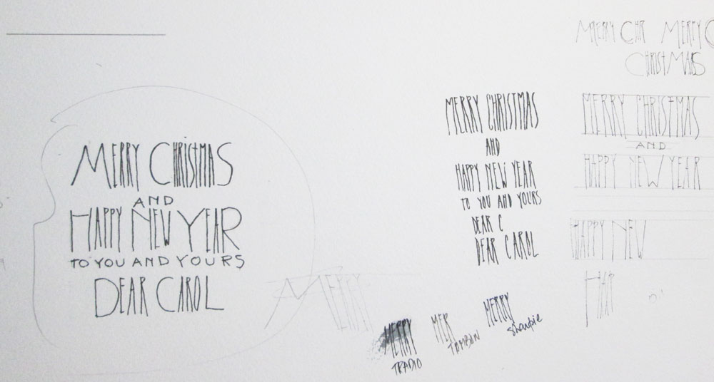
6. Another consideration was the kind of pen I would use to write on that weird textured paper. Not all pens can take the roughness, and not all inks are waterproof. This test was pretty conclusive: even though the writing looks a bit wobbly due to the texture, and the paper's high absorbency, the Sharpie was the best fit for the job.(It does bleed right after you use it, but becomes waterproof with time.)

7. It took far more time and experimenting to find the right brush for painting the single snowflake on each card. I tried about a dozen, and the only one that would hold enough paint for a whole snowflake, and had a point fine enough for the lines, was my No. 8 Escoda Perla Joseph Zbukvic that I bought in Barcelona, where they are manufactured, in 2012. According to this review, I couldn't have made a better choice.
8. The next step was to produce a sheet of snowflakes to print out for making the envelope linings. A small detail which I hoped the card recipients would appreciate, though if they did notice it they would probably think the envelopes came like that instead of being painstakinly hand-lined one by one.
I painted an 11 x 14" page of different snowflakes, dots and so on, then I scanned a section of it for the linings, and printed 12 copies -- I needed half a page per envelope.

At this point, I was ready to mass-produce my very own Christmas cards.
Saturday
Winter
As I drove down the street during our previous blizzard, I saw a woman brushing snow off her car and I thought to myself, now that's the perfect Canadian winter scene.
The perfect picture to paint.
I tried drawing it from memory - no luck.
Google to the rescue! The photo I found, and copied in watercolour, was very similar to the scene I saw, except that my model was wearing a big tuque with a fluffy pompom. The lady in the photo was using her umbrella to knock off the snow. I turned it into a red brush. I like the pop of colour.
Here is my full painting:

And here it is, cropped differently, as a square format.

I can't decide which I like best.
I titled it simply "Winter".
I've Been Away, But Not Idle
I'm back at the drawing table, thanks to Creativebug.com. $7 or so gives me access to all the classes, and so far my favourite art instructors have been Lisa Congdon - whom I discovered thanks to her wonderful, whimsical folk art colouring books - also Pam Garrison and Yao Cheng, whose magical calligraphic brushstrokes I'm trying to imitate, so far with limited success!
Here are just a few of the many drawings I've uploaded to my Creativebug gallery (yes, you get your own gallery).


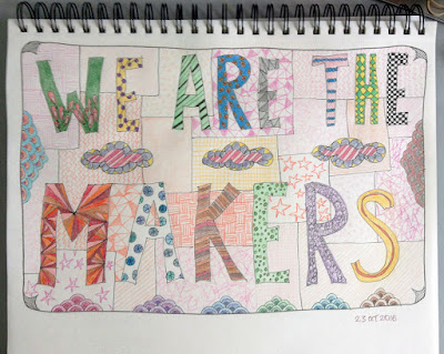

Here are just a few of the many drawings I've uploaded to my Creativebug gallery (yes, you get your own gallery).


The monthly fee I quoted is in Canadian dollars; it's even less in US funds, and the first month is free. If you prefer, you can purchase individual classes and then you will have access to them forever.
The other way to have permanent access is to take advantage of one free class for each month of membership. That way, you can accumulate quite a library, but at any rate, as long as you pay your monthly fee (by automatic deduction from your credit card), you have access to all the hundreds of classes in all the different categories (art, sewing, cooking, etc.)
The platform is very user friendly and oh yes, in case you're wondering, I'm not getting anything for this obviously biased review!
Macbeth's Outhouse
 |
| Macbeth's Outhouse, Fall 2010, Watercolour on Paper Click to enlarge. |
There’s an interesting story attached to this painting.
In the small New Brunswick village where I live, the nicest area for walking is to the left of my
house, towards the countryside. At one point you are quite high up and you get
a great view of the valley, unobstructed by the forest.
When I'm out in that direction, my preference goes to some of the more intimate places,
and of all those, my favourite is a lane with an intriguing sign at the road.
It’s just a wooden board on which the word “Macbeth” is painted in white.
When I first saw it, I thought, oh my, we have an
intellectual living around here! Because of course I assumed it referred to the
Shakespeare play.
It was only a few years later that I found out that Macbeth is a relatively common
family name around here!
That lane is especially beautiful in the fall, as it is
bordered on each side with a row of trees, and that’s when the long driveway
itself is covered by a thick carpet of multicolored leaves.
At the end of the lane, there is a small camp – hunting is a
big hobby around here – and a few feet away sits the outhouse. When I saw that outhouse I knew I had to
paint it, so one day I lugged my art supplies up there and conquered my fear of
bears and alligators, and I produced this painting. That was in
2010. The date is right on the painting.
I put the painting away and forgot about it until last week. My friend Carol and I were driving around, and I mentioned to her that we were about to
pass my favourite spot in the whole village, the Macbeth place. Then I told her
about painting the outhouse. She immediately asked if I still have it and I
said I was sure it was somewhere and she said the Macbeths would be delighted
to have it (not only does Carol know everyone in the village, it so happens that Beth Macbeth is her hairdresser). I said I’d look for it.
Which I did. I scanned it and sent it to her, to get her approval I guess, and she liked it and assured me that they would like it for sure. I said I’d frame
it for them, and I was very lucky to find this perfect frame, complete with charcoal
mat, on my next trip to the city.
Of course I couldn't resist titling it "Macbeth's Outhouse".
Monday
Pen Improvisation Practise
 |
| Pigma Micron 01 Pen - Strathmore Sketchbook |
It was great fun and it took hours--I could have done another one but I have a life to live, and bread to bake!
Sunday
More Basic Pen Strokes
 |
| Micron Pigma 01 Pen - 8.5 x 11" Strathmore Sketchbook |
A further selection from those two pages of The Technical Pen .
.
I haven't had this much fun in a long time! Mostly it's because I don't have to think: I just try to copy as exactly as possible. Sometimes I'm successful, sometimes not so much. The pleasure is the same.
Friday
Practise Makes Perfect?
I'm not really after perfection, I just want to feel confident when I trace a line with a pen. I want my hand to draw what my brain wants it to draw.
Although it's true that some seem to be born with a talent for drawing, for the rest of us folks it's all about practise, practise, practise. So they say.
I've had The Technical Pen (subtitled Techniques for Artists, by Gary Simmons) in my library for many years, and I'm finally getting around to doing the exercises.
This is my first offering--it's a selection from page 70.
This kind of work is so contemplative that I can't even tell you how many hours it took! Most of the afternoon, I think.
As you can see, I'm better at the patterns that seem more complicated, yet don't require too much initiative! That's why my favourites are 2, 4, 5 6, 10, 13 and 14.
More of this to come in the next few days.
By the way, if you're interested in technical pens that is THE book to get. But if you just want to draw with disposable ink pens (like the Microns that I use), or pens with nibs, or fountain pens, the information in the book is just as valuable.
Although it's true that some seem to be born with a talent for drawing, for the rest of us folks it's all about practise, practise, practise. So they say.
I've had The Technical Pen
(subtitled Techniques for Artists, by Gary Simmons) in my library for many years, and I'm finally getting around to doing the exercises.This is my first offering--it's a selection from page 70.
 |
| Micron Pigma 01 pen, 8.5 x 11 Strathmore sketchbook |
This kind of work is so contemplative that I can't even tell you how many hours it took! Most of the afternoon, I think.
As you can see, I'm better at the patterns that seem more complicated, yet don't require too much initiative! That's why my favourites are 2, 4, 5 6, 10, 13 and 14.
More of this to come in the next few days.
By the way, if you're interested in technical pens
that is THE book to get. But if you just want to draw with disposable ink pens (like the Microns that I use), or pens with nibs, or fountain pens, the information in the book is just as valuable.
Subscribe to:
Posts (Atom)